(01).
PROJECT
Project goals
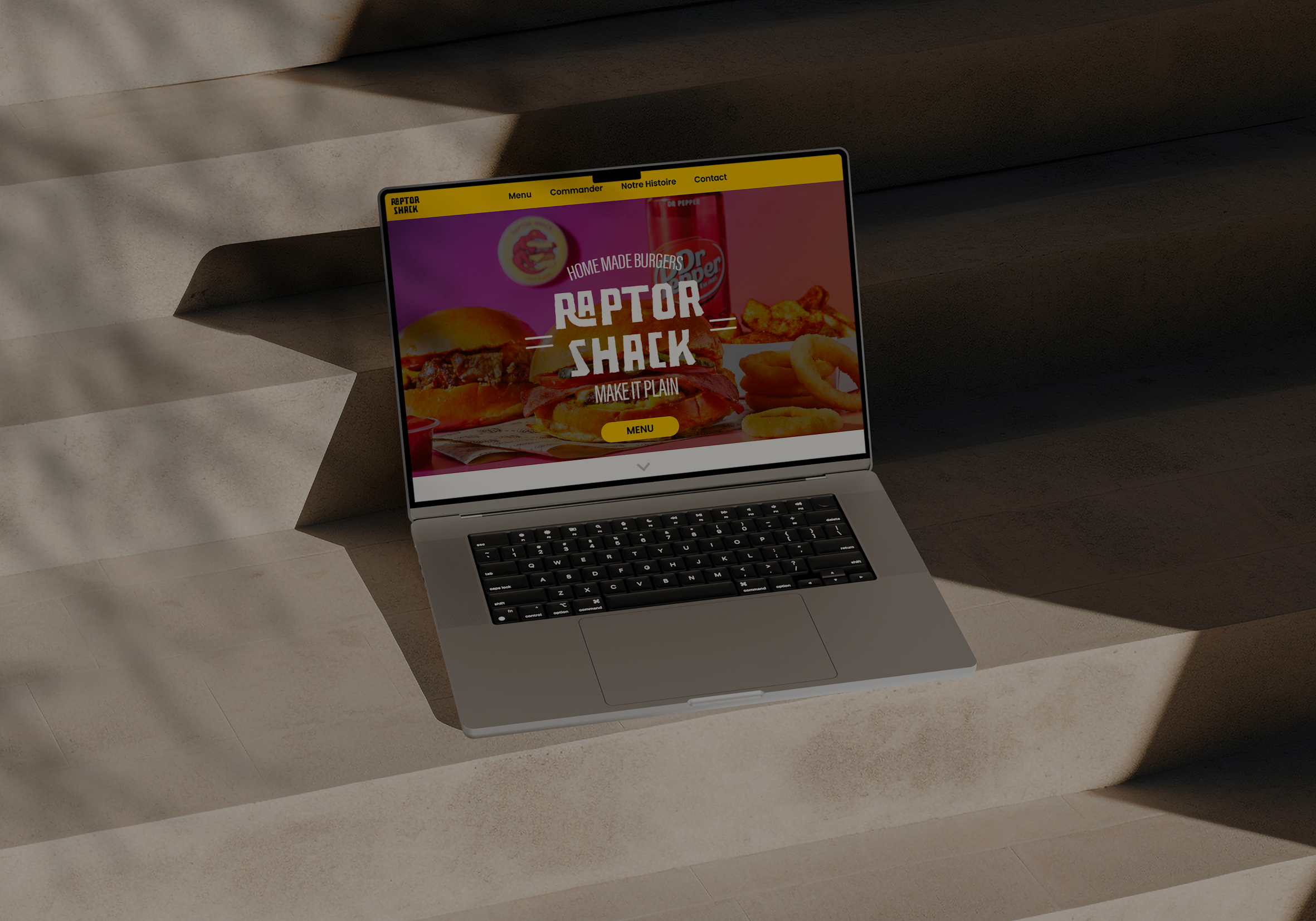
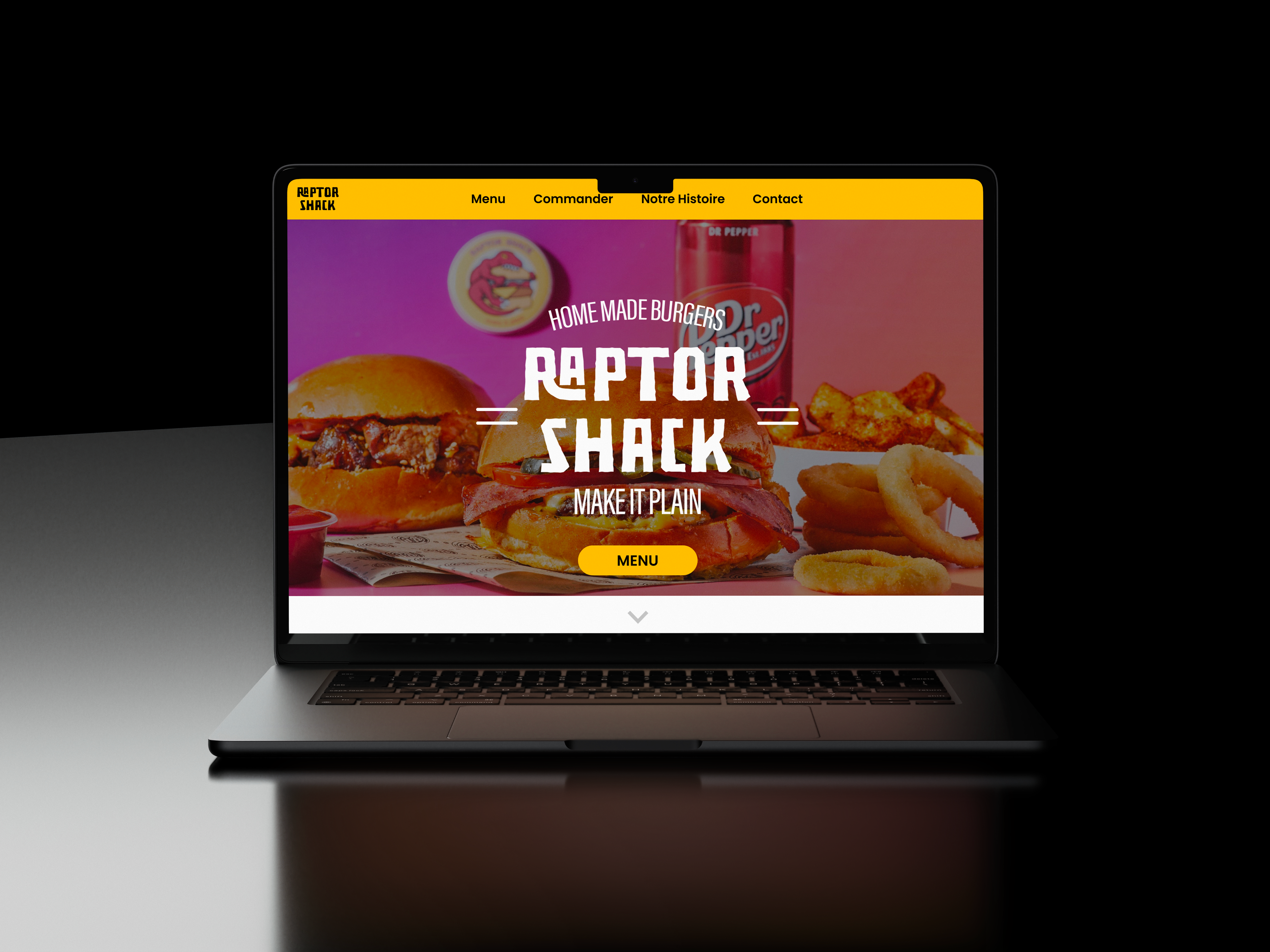
Redesign school project for the website of the Lille-based fast food restaurant, Raptor Shack. The restaurant presents itself as a trendy fast food spot targeting a young audience, specifically students, thanks to its low-price range and dynamic logo. It is more inspired by affordable American restaurant chains rather than gourmet establishments.
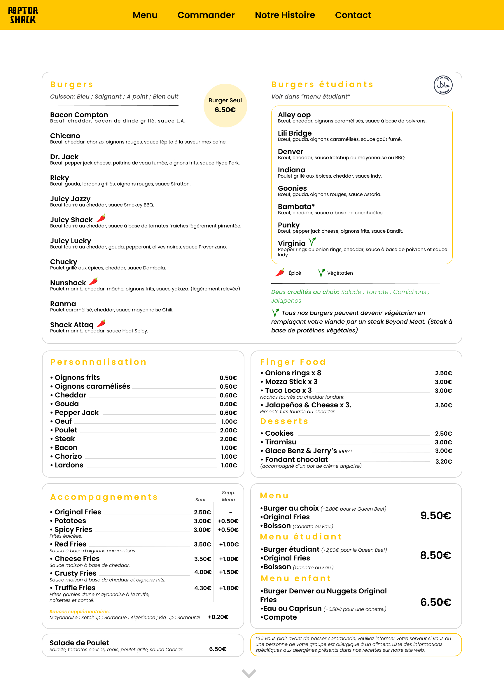
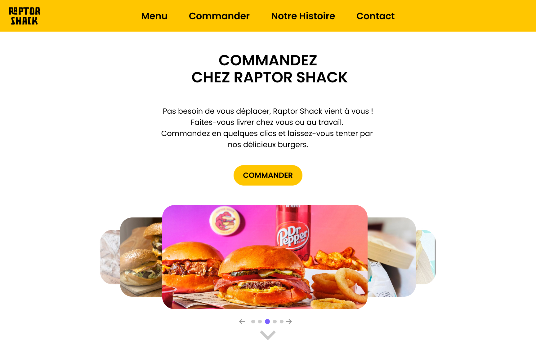
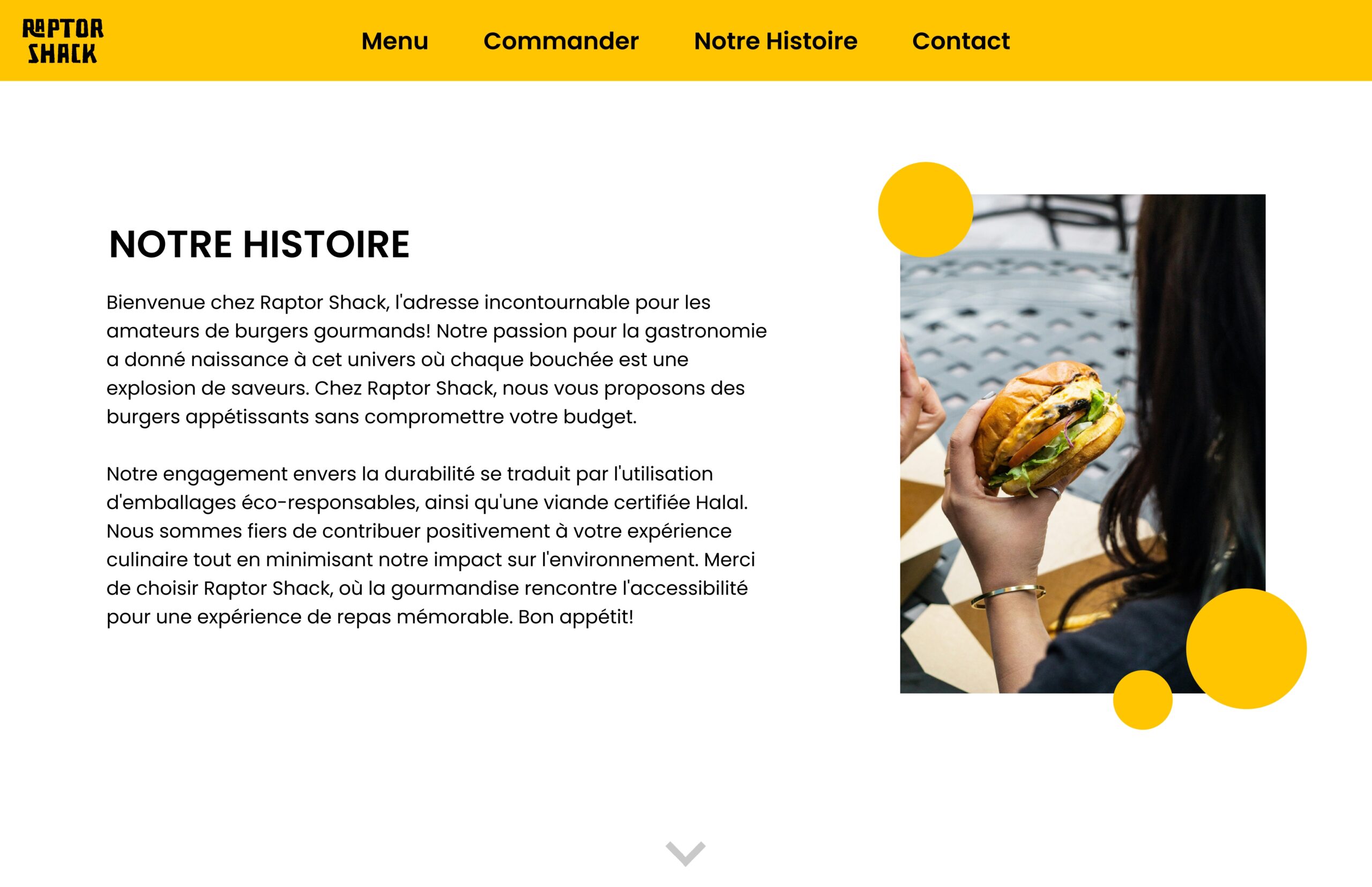
Based on the competitive benchmarking study, the goal was to envision a redesign of the website and menu in the style of our choice, tailored to the target audience. I wanted to emphasize modernity and simplicity to give the site a fresh new look, as the previous version was too "harsh" and difficult for users to understand.
(02)
PROCESS
First, I conducted competitive research within Lille as well as with burger restaurants across France and Belgium. I studied their websites to better understand their choices in terms of accessibility and design.
I didn’t focus solely on budget-friendly restaurants but also looked at higher-end establishments to elevate my graphic identity while still offering products at the same price point.
(03)
GRAPHIC IDENTITY
I kept the brand's colors as the primary color, with yellow as an accent color and white as a secondary color, mainly for the background. For the font, I used Poppins, a geometric sans-serif typeface known for its clean, modern lines and balanced proportions, ideal for digital interfaces and readable at various sizes.
I also completely redesigned the logo, opting for a text-based logo with a square composition. This enhances readability while preserving the restaurant's identity, as the previous logo had numerous visual inconsistencies.
